


Détour
Turning everyday routes into opportunities to explore the city
00
year
timeframe
context
tools
contributors
00
Intro & Context
This project was developed in an academic context, where the prompt was to design a fully implemented form of calm technology. Calm technology refers to systems that communicate information without demanding constant attention, allowing users to remain focused while staying peripherally aware of what matters. Rather than creating another notification-driven tool, the goal was to design a solution that could exist in the background, integrating seamlessly into everyday workflows while still being realistic to implement and grounded in real user needs.
Problem:
Despite the abundance of productivity tools, people still lose track of time when they are deeply focused. Notifications are silenced, ignored, or missed entirely, especially in environments shaped by headphones, multitasking, and long desk-based sessions. What begins as focus often results in missed transitions, rushed work, and unnecessary stress.
The issue is not a lack of planning tools, but a lack of awareness in the moment. Existing systems rely on active attention, requiring users to check, respond, or interrupt themselves to stay on track.
Solution:
This project explores an alternative: what if awareness could exist in the background?
The proposed solution is an ambient system that uses subtle, peripheral cues embedded in the user’s environment to signal time, task transitions, and focus states. By shifting information away from screens and into physical space, the system supports users without interrupting them, aligning with the principles of calm technology.
01
From Observation to Insight
Task-Based Analysis of Work Behavior
Understanding Invisible Breakdowns in Focus
The project began with a simple observation: people were not failing to plan their work, they were failing to stay aware of it.
Students and remote workers often work in deep focus, wearing headphones, immersed in a single task. In these moments, notifications are muted, ignored, or never noticed. Time passes unnoticed, transitions are missed, and what begins as productivity often turns into stress.
We set out to understand this breakdown.
Starting in the Wrong Place
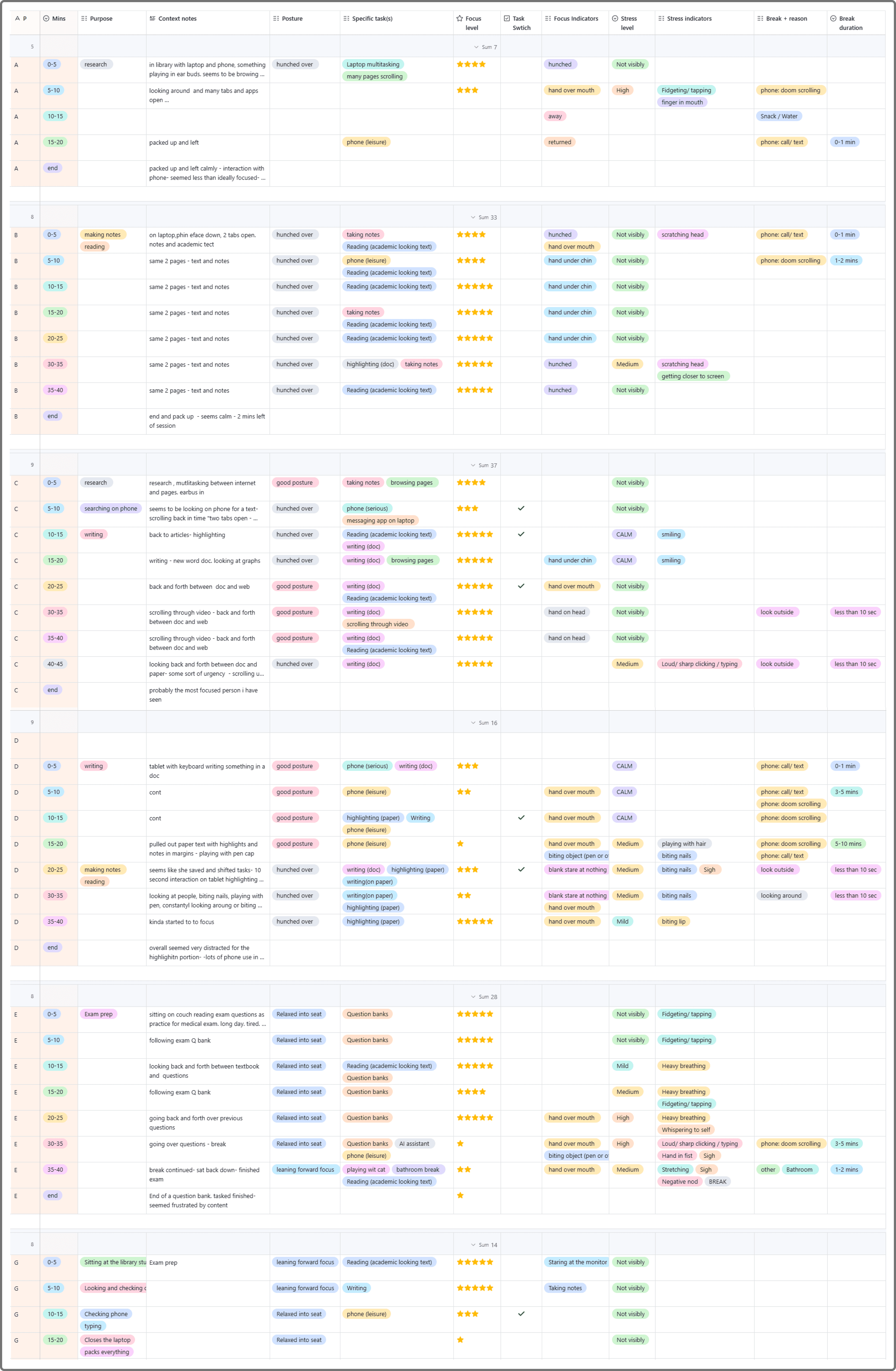
Our first instinct was to observe real behavior. We conducted 40-minute observation sessions with eight participants across a library and a home environment, carefully tracking their focus, posture, task switching, and break patterns.At a surface level, patterns quickly emerged. Most participants moved between three types of work: consuming information, researching, and producing output. These cycles gave us a structured view of how work unfolded.
But something felt off.
The library environment was doing too much of the work. It naturally enforced focus, routine, and discipline. Participants appeared more organized and intentional than they might be in their everyday environments.
More importantly, we could see what people were doing, but not why. Moments of distraction, frustration, or disengagement were ambiguous. A participant leaning back could signal deep thinking or complete disengagement. A phone break could be recovery or avoidance. When someone abandoned a task, we couldn’t tell whether it was strategic or a breakdown.
For a project centered on awareness, this was a critical gap.
Partial capture of library observation data collection table
Shifting the Approach
We realized that the problem we were trying to design for, cognitive overload, missed transitions, and overwhelm, could not be understood through observation alone.
So we pivoted.
We introduced a mixed-methods approach, combining interviews and surveys to access what observation could not capture: internal states, motivations, and coping strategies. This shift allowed us to move from visible behavior to underlying experience.
Data collection table
Patterns Beneath the Surface
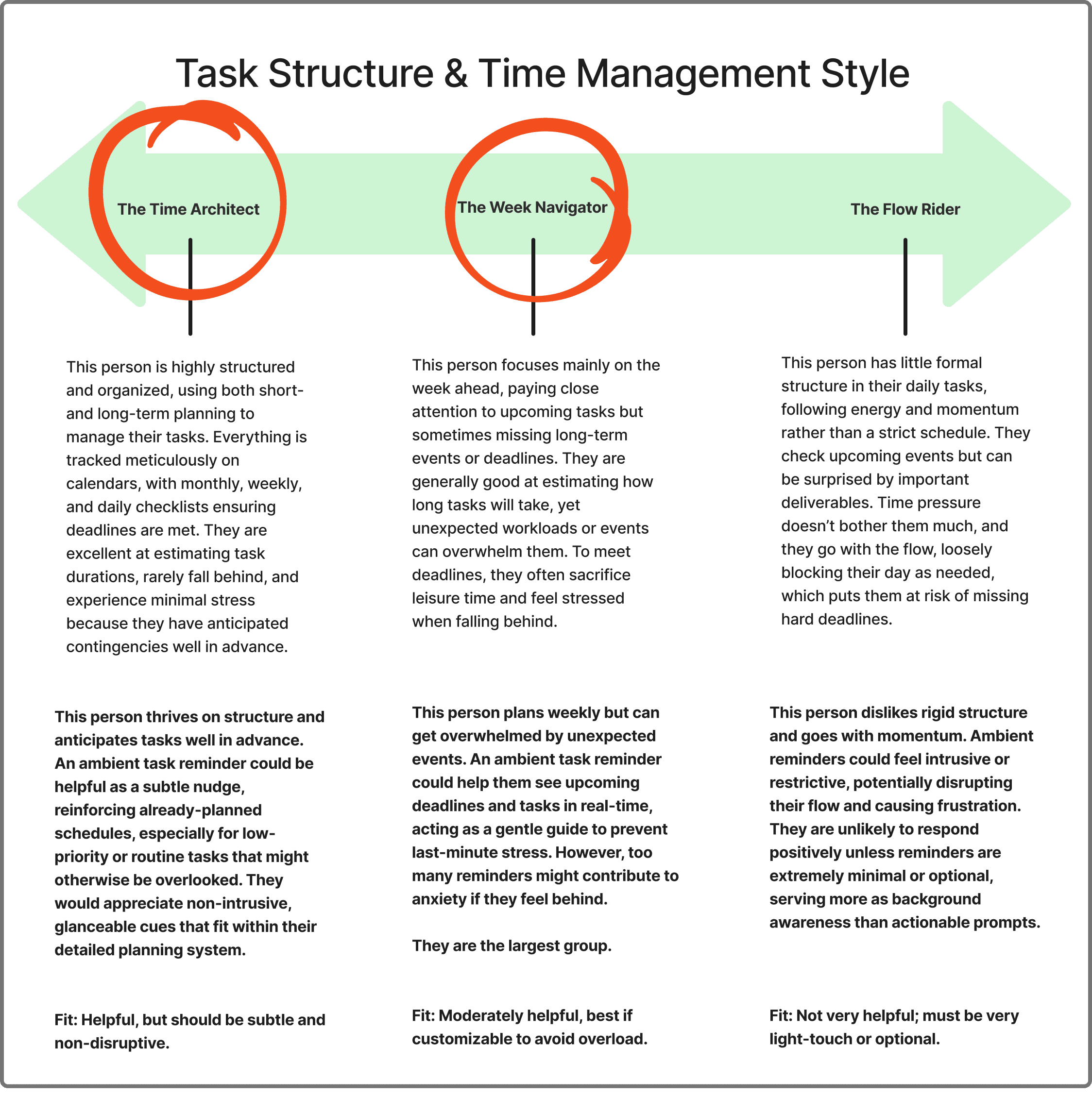
As we analyzed responses, two behavioral patterns began to emerge that helped explain why existing productivity tools often fail to support real work behaviors.
The first was how people structure their time. Some participants relied on highly structured systems built around long-term planning, detailed calendars, and carefully managed buffers. Others worked in a more fluid way, guided by weekly intentions and shifting priorities shaped by energy and context. Across both, a recurring challenge was not planning itself, but accurately estimating unfamiliar tasks, which often disrupted even well-designed systems.
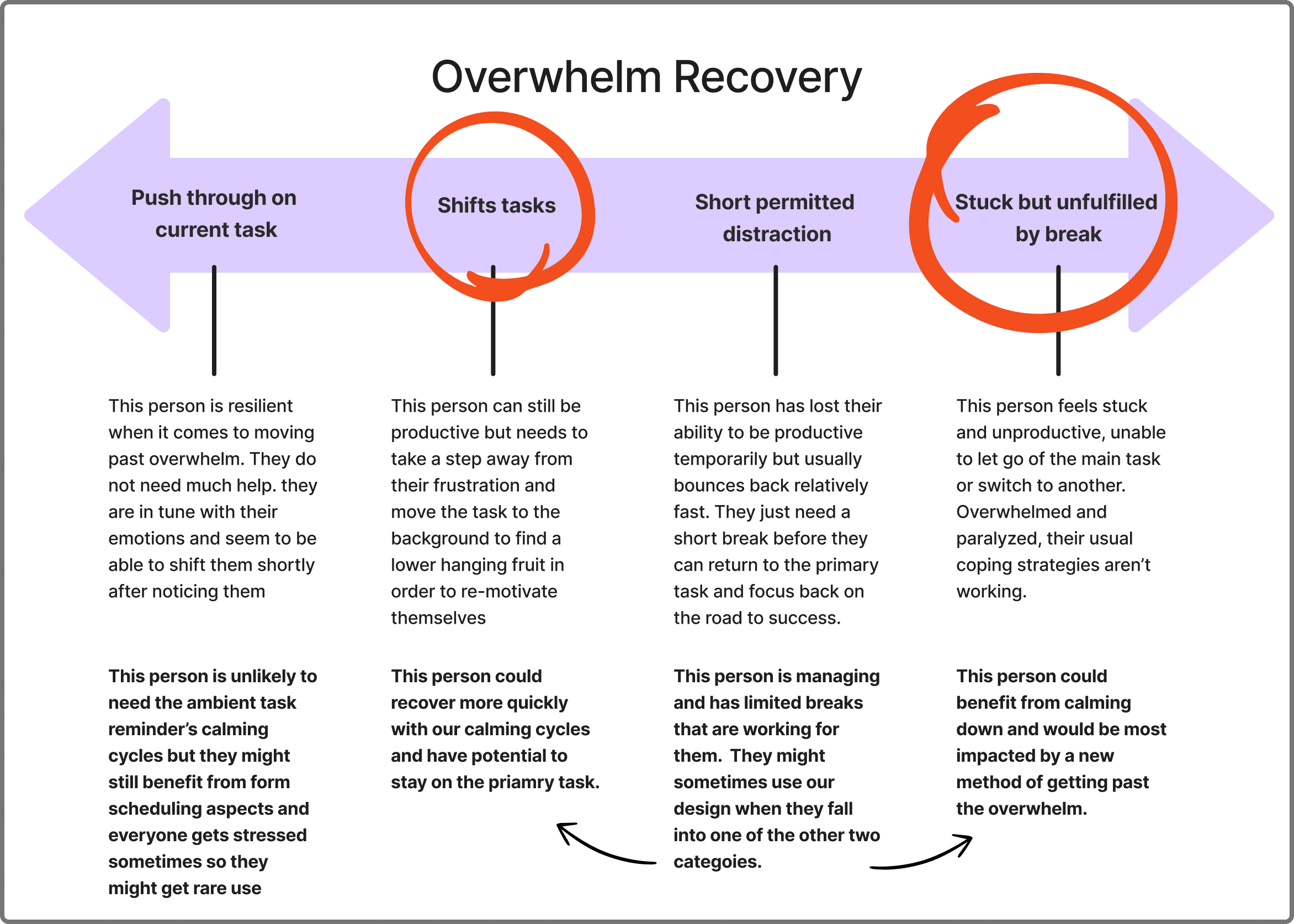
The second pattern related to how people recover from moments of overwhelm. Some participants were able to regain control by adjusting priorities, taking short breaks, or switching tasks before returning to focus. Others experienced a more persistent breakdown, where stepping away did not lead to re-engagement and the task remained unresolved.
What this revealed is that productivity is not only shaped by planning habits, but by how people move between states of focus, uncertainty, and overwhelm. These transitions are where existing systems struggle the most, as they assume stable attention and linear progress rather than fluctuating cognitive states.
Productivity challenges are not only about planning or discipline, but about maintaining awareness during change and supporting recovery when momentum is disrupted.
Designing for Real People
Personas
To translate these patterns into design direction, we used a task-based segmentation approach, grouping participants based on how they structure time and how they respond to overwhelm. This method allowed us to move from behavioral patterns to distinct working profiles that reflect real differences in how people experience productivity.
From this segmentation, we synthesized two personas that represent distinct but realistic working styles.
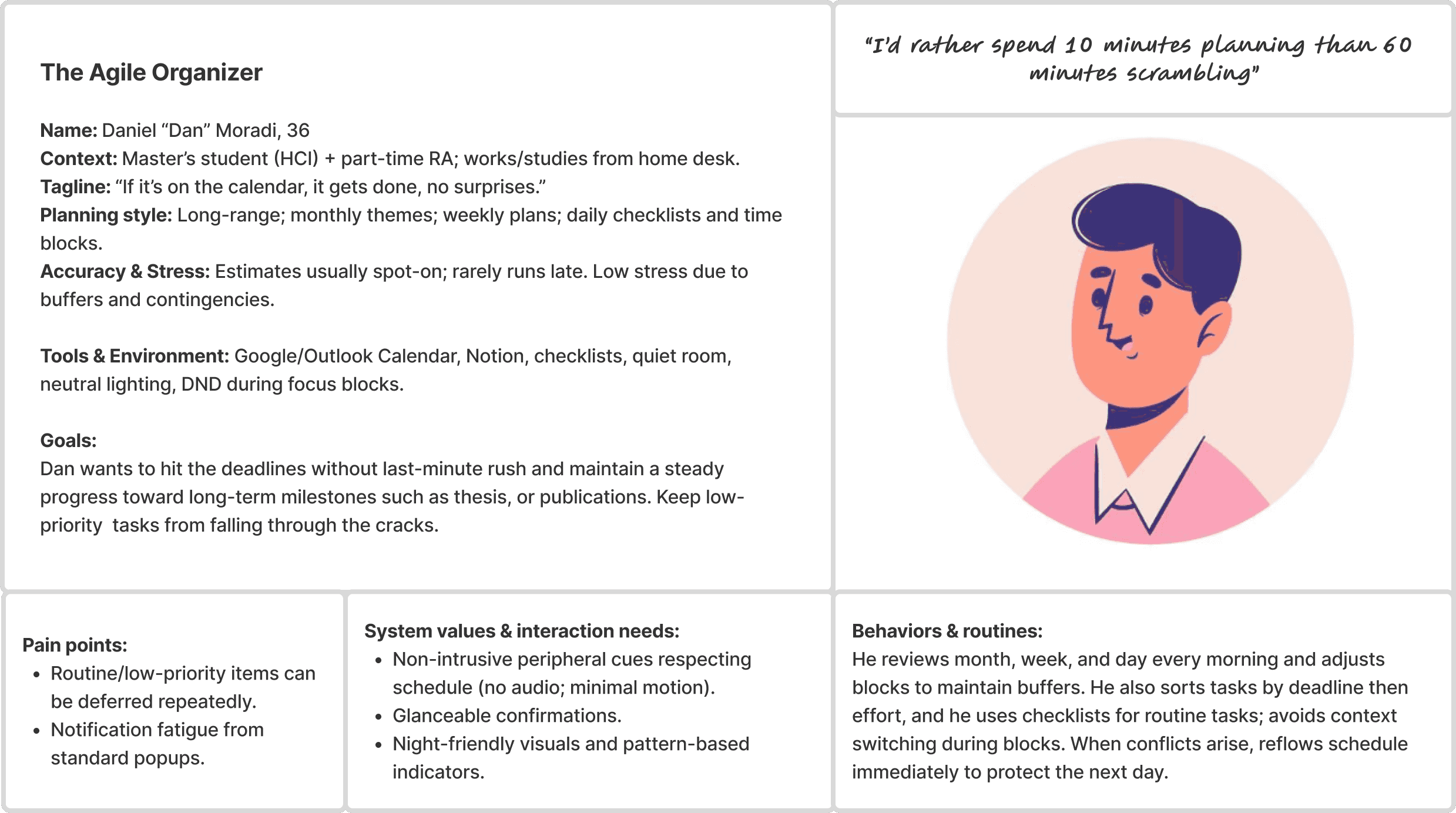
Dan, the Agile Organizer, represents a highly structured working style. He relies on detailed planning, maintains strong control over his schedule, and rarely falls behind. While he is generally resilient to disruption, he still benefits from subtle reinforcement that helps maintain awareness without interrupting focus. For Dan, the ideal system is non-intrusive, predictable, and seamlessly integrated into existing planning tools.
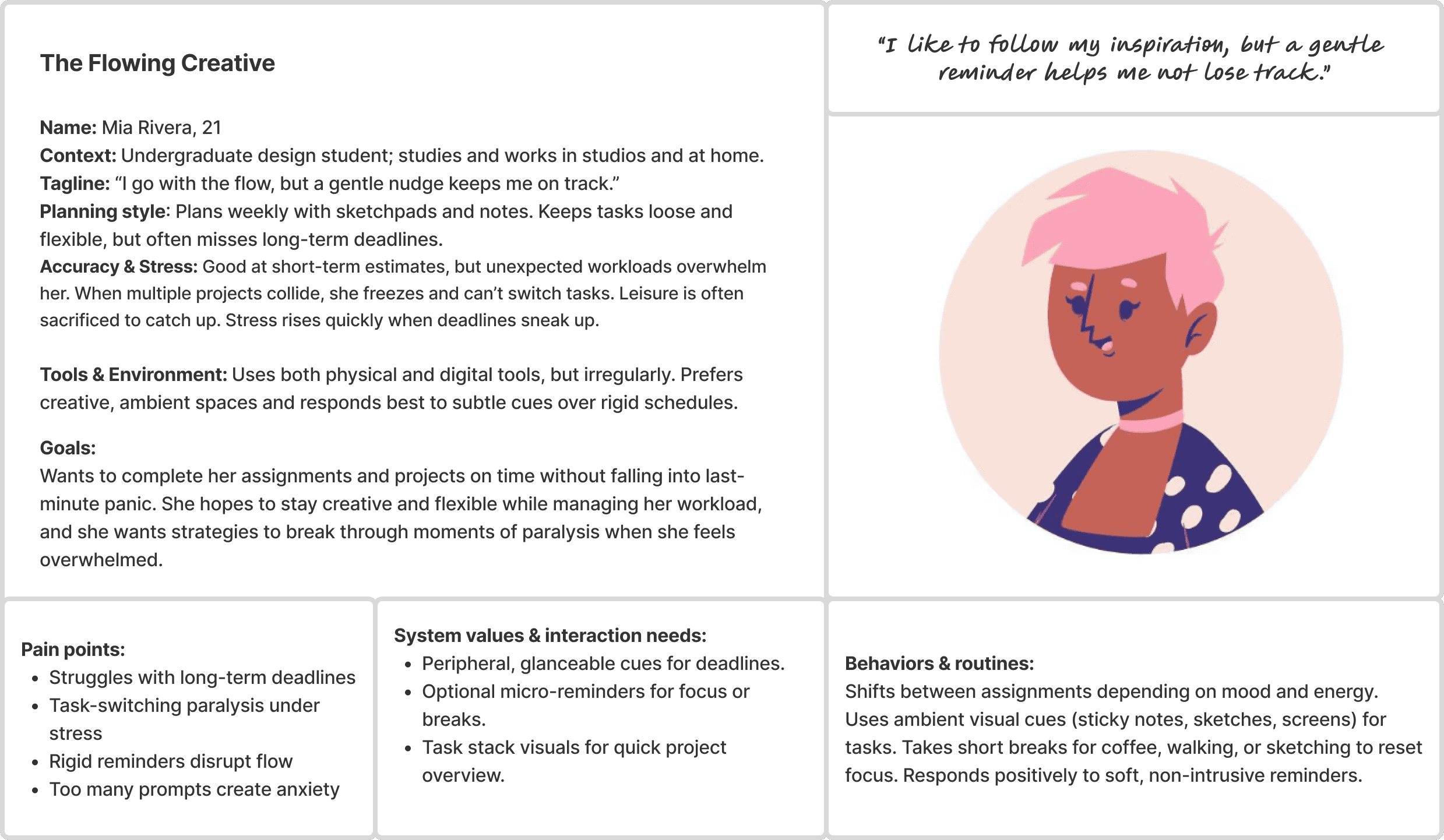
Mia, the Flowing Creative, represents a more fluid working style. She is motivated and creative but struggles with long-term structure and is prone to losing track of time or becoming overwhelmed when tasks accumulate. For Mia, rigid systems increase stress, so she responds best to gentle, ambient cues that help her stay oriented without disrupting her flow.
Together, these personas highlight a core tension revealed through the segmentation: users require support that adapts to both structured and fluid ways of working without increasing cognitive load. This tension directly informed the direction toward an ambient, peripheral system designed to support awareness rather than demand attention.
Use Case Scenario: Mia and Ambient Task Awareness
Mia gets home from class and sits down at her desk, thinking about everything she needs to do. Some tasks feel exciting, others feel heavy, and she is not entirely sure where to begin.
She opens her task app and maps out her day. Once she starts working, time begins to slip in the way it usually does. She focuses, loses momentum, and drifts, but this time she is not completely disconnected. Subtle cues in her environment keep her aware of time passing without asking for her attention.
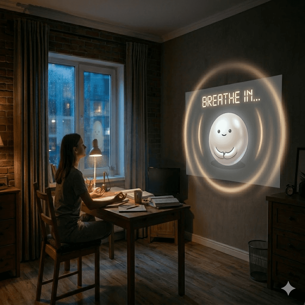
At one point, she starts to feel overwhelmed. Instead of pushing through or reaching for her phone, she takes a short break. The system gently supports this pause, helping her step away and reset without losing track of her work.
When she returns, she feels more grounded and able to continue. The system does not interrupt her or tell her what to do. It simply keeps her on track in the background.
By the end of the session, she has made progress across her work and avoided the usual spiral of stress. She stays oriented, not because she is forced to, but because she never fully loses awareness.
Competitive Landscape
Where Existing Tools Break Down
Most productivity tools are designed around control and visibility, but real work does not always follow structured plans.
Task managers and calendars help users organize their time, but they rely on constant interaction. Users must check them, update them, and respond to notifications. During deep focus, this breaks down. Notifications are ignored, silenced, or missed entirely, which leads to the very problem these tools aim to solve: losing track of time.
Ambient systems take a different approach by moving information into the environment. While they reduce interruption, their signals are often too abstract. A change in light or color can indicate that something is happening, but not what action to take or when. Without context, these cues become easy to ignore.
Other tools focus on stress and well-being, helping users calm down or refocus. While valuable, they operate separately from task management. They respond to overwhelm after it happens, rather than helping users stay on track before it builds.
Across these approaches, a consistent gap emerges. Tools either demand attention, lack meaningful context, or fail to connect productivity with emotional support.
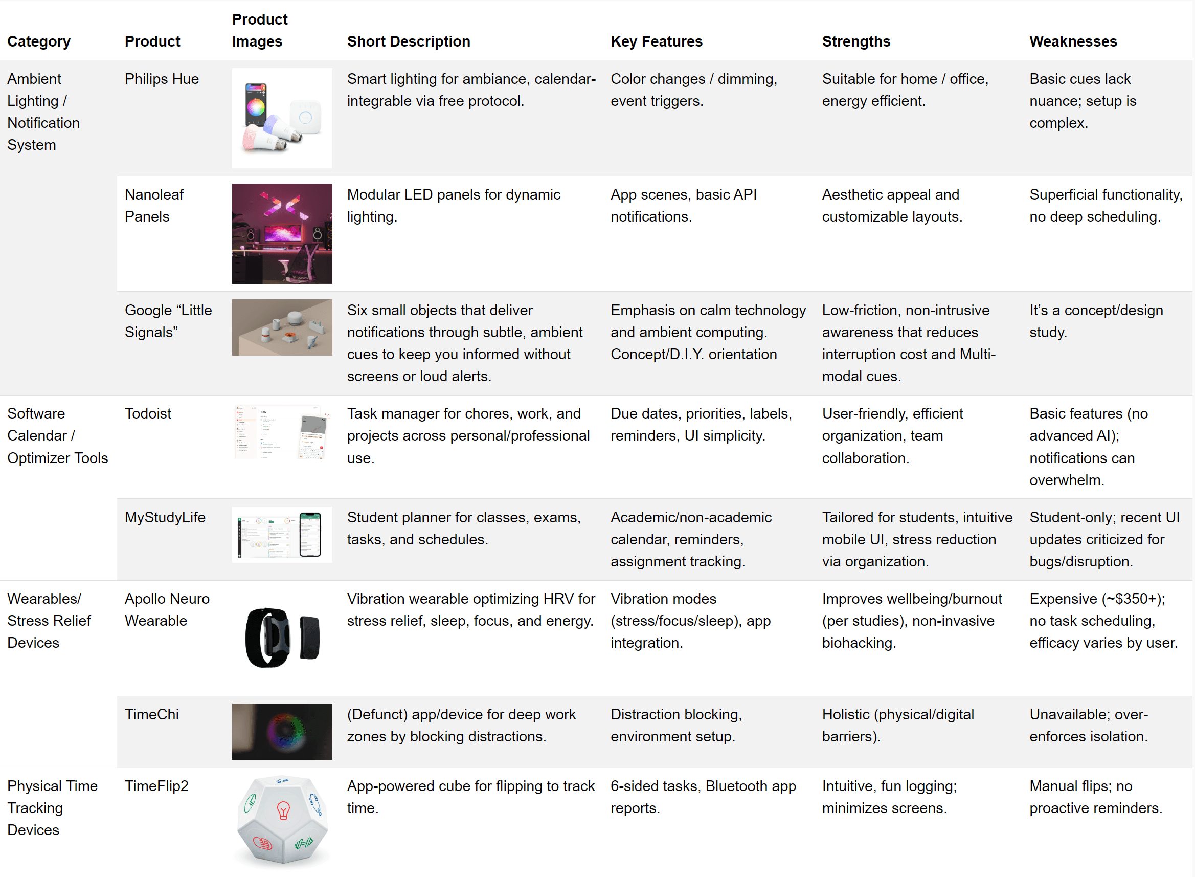
Detailed comparison across product categories
Positioning the Solution
Designing for Awareness, Not Attention
This system focuses on awareness as something that exists in the background rather than something users must actively manage.
Information is moved into the periphery through subtle, contextual cues that communicate time and task progression without interrupting focus. Users remain aware without needing to check a screen or respond to alerts.
The system also adapts to real workflows. It supports flexible task management, allows users to pause or adjust without friction, and introduces moments for recovery before overwhelm builds.
Instead of increasing control, the design reduces the need for it. Users stay oriented, maintain momentum, and make decisions in the moment without being pulled out of their work.
This approach aligns with calm technology by keeping information in the background until it is needed, supporting users without demanding their attention.
01
Defining the Design Opportunity
From Insight to Direction
The patterns we uncovered pointed to a shift in how productivity should be understood. The issue was not that people lacked structure, but that existing systems failed in the moments that mattered most, during transitions, uncertainty, and overwhelm.
This reframed the problem. Instead of asking how to help people plan better, we began asking how to support them while they were already working.
What would it look like to stay aware of time without checking a screen?
How could a system guide attention without interrupting it?
These questions led to a different kind of direction, one grounded not in adding features, but in changing where and how information appears.
Moving Beyond the Screen
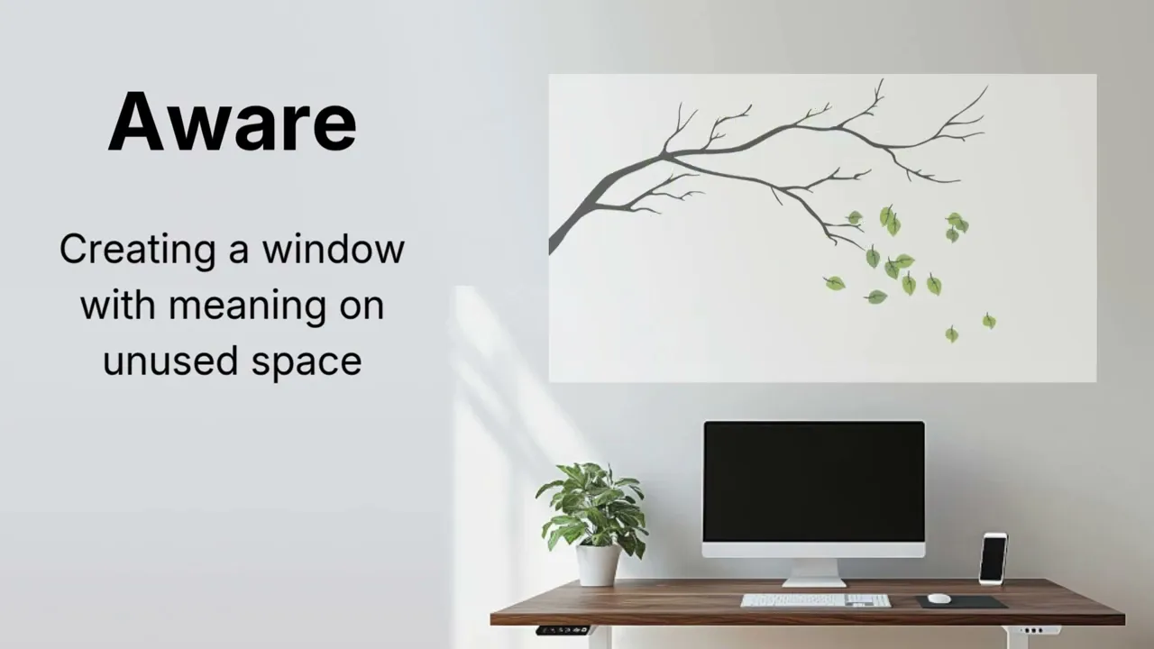
We began exploring the idea of shifting task awareness out of devices and into the physical environment.
Across observations, one behavior appeared consistently. When thinking, processing, or pausing, participants often looked slightly above or beyond their screens. These small moments revealed an overlooked opportunity. The space around the user, especially the wall behind their workspace, was present, visible, and unused.
This became the foundation of the concept. Instead of competing for attention on already crowded screens, the system could exist quietly in the background, using peripheral vision to communicate.
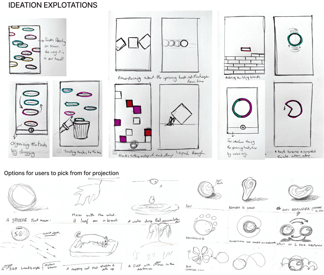
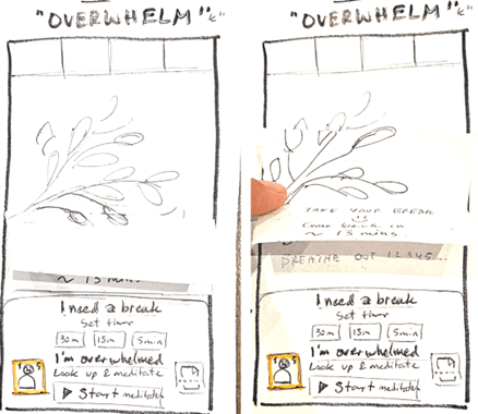
The Projection
What Feels Calm, What Feels Intrusive
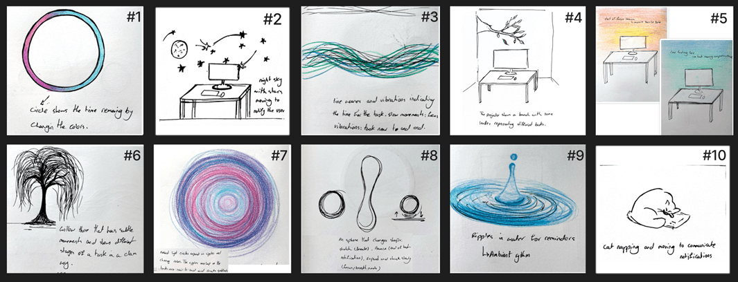
Participants were shown ten projected concepts and asked to interpret what they communicated and how they felt in a workspace. The conversation quickly moved beyond aesthetics into emotional response. Some visuals were seen as motivating, others as distracting or stressful. Concepts that felt too literal or too fast were often rejected. What stood out instead were designs that felt calm, continuous, and almost alive.
The leaf-based concept (#4) emerged as the strongest direction.
Participants described it as natural, non-intrusive, and adaptable over time. More importantly, it did not feel like a tool. It felt like part of the environment. This distinction became important. If the system was meant to support focus, it could not behave like another interface demanding attention.
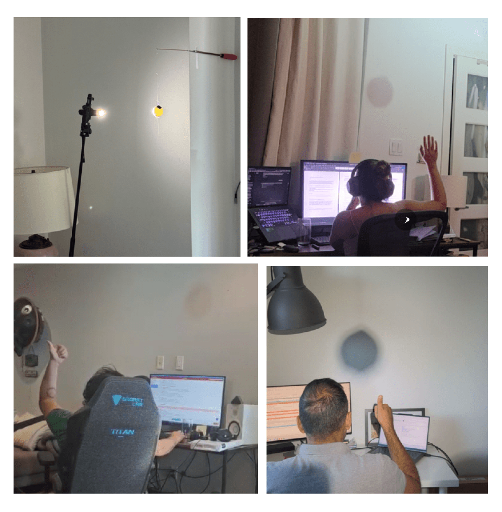
Making the Concept Tangible
At this stage, the idea was still abstract. We needed to understand whether ambient cues could actually be noticed and interpreted during real work.
So we built the simplest possible prototype.
Using a flashlight, a ping-pong ball and some fishing line, we simulated subtle movement on a wall to represent time passing. Participants worked on their own tasks while these changes occurred in the background.
What mattered was not precision, but perception.
Across sessions, participants consistently noticed the changes, often within just a few seconds, without needing to shift their attention away from their work. No cues were missed. Even in bright daylight or mixed lighting environments, the signals remained visible and legible.
What stood out was how quickly people adapted. Initial reactions sometimes included brief distraction, especially when motion was more pronounced, but this faded as participants settled into their tasks. The cues became something they registered peripherally rather than actively watched.
Participants did not describe the system as a timer. Instead, they described it as reassuring, a subtle presence that helped them stay anchored in time without pressure. Several noted that it made them feel more in control of their pacing, particularly when working on open-ended or cognitively demanding tasks.
Patterns began to emerge around what worked and what did not. Slower, predictable cues were preferred over frequent or abrupt changes. Signals placed at meaningful moments, such as halfway through a task or shortly before the end, were seen as the most helpful. In contrast, faster movement or last-minute cues sometimes introduced slight stress, especially when users were already feeling behind.
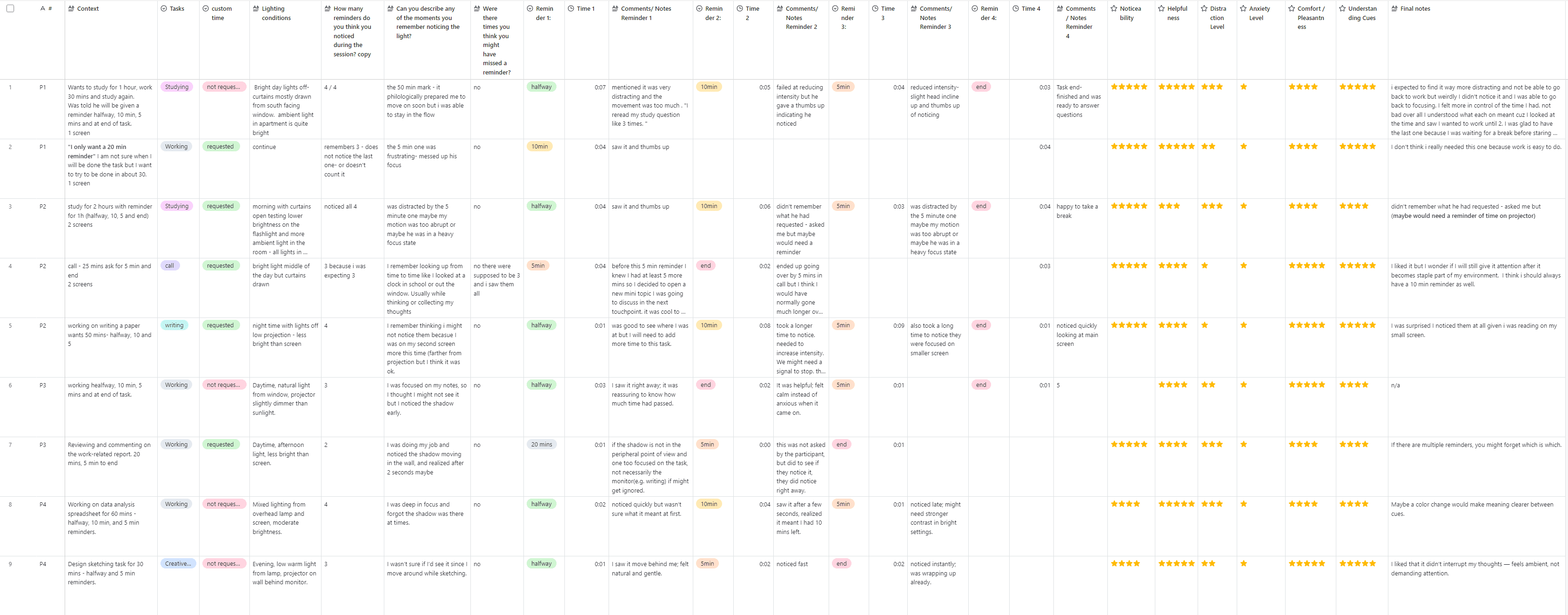
Part of data collection table for ping-pong ball testing
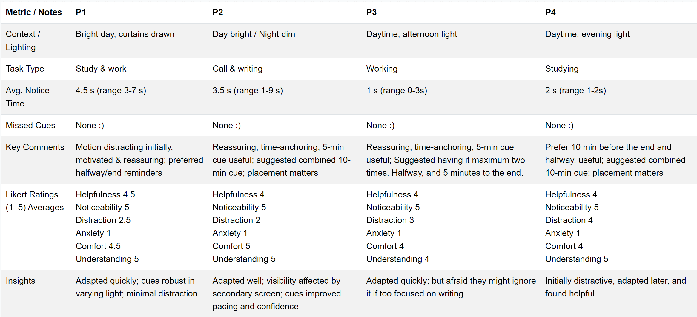
Data collection Averages
Context also mattered. Tasks requiring deep writing or sustained focus were more sensitive to interruption, suggesting that cue duration and intensity would need to adapt to the type of work being performed. Placement played a role as well. When cues were positioned more centrally in the user’s field of view, they were noticed more reliably than when placed off to the side.
Overall, the system achieved something subtle but important. It maintained awareness without demanding attention.
These findings established a clear direction. The ambient layer was not only viable, but effective, as long as it remained calm, predictable, and adaptable to context. This would become a core constraint moving forward, shaping how the system communicates without ever becoming another source of interruption.
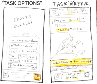
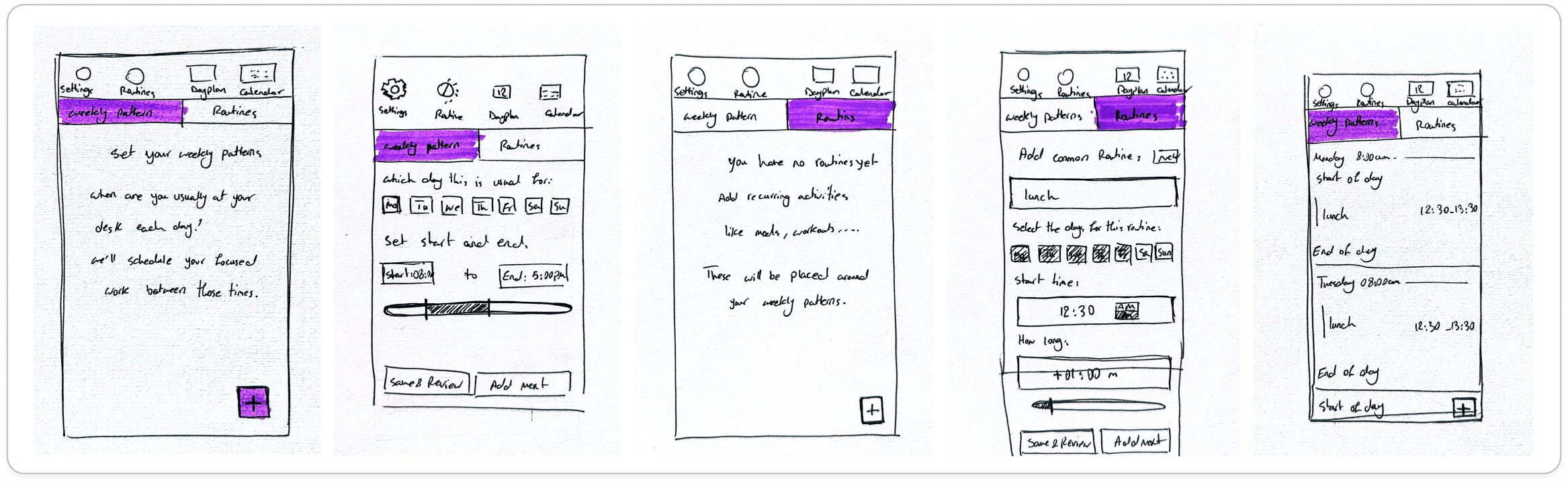
The App
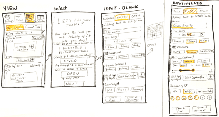
Exploring Interaction Through Paper Prototypes : AB Comparison
With early confidence in the ambient projection layer, we turned to the second part of the system: how users would plan and interact with their tasks through a supporting interface.
At this stage, the focus was intentionally on the app experience rather than the projector itself. The goal was to understand how users would input, structure, and manage tasks, before translating those decisions into ambient cues in the physical environment.
We developed two low-fidelity directions. One emphasized structured routines and task lists, while the other introduced zones, flexible task types, and moments of emotional support. Participants completed both versions using a think-aloud approach, as they organized their day, added tasks, and adjusted plans in real time. This allowed us to observe not only task completion, but also how users interpreted and made sense of the system while interacting with it.
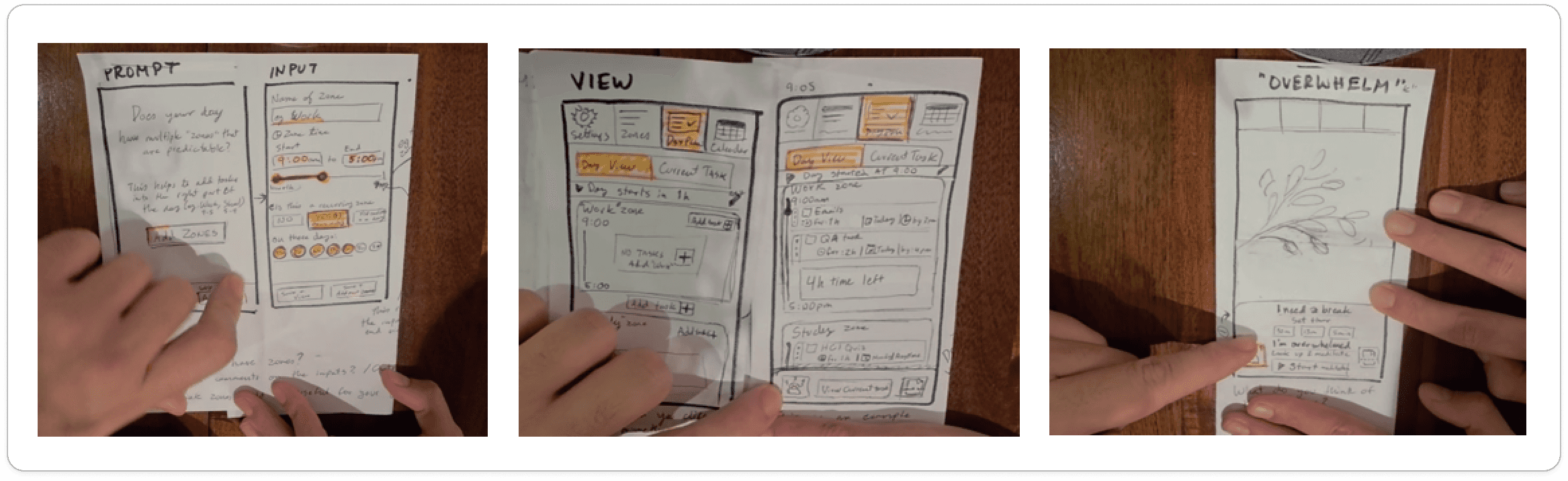
Photos of some screens from test of "A" paper proto
Photos of some screens from "B" paper proto
What became immediately clear was that both systems were usable, but neither was naturally intuitive once complexity increased. As additional layers were introduced, participants began to slow down, question terminology, and revisit earlier steps. Concepts like zones, routines, and task types often blurred together, making it difficult to build a consistent mental model of the system.
Despite this, user intent was consistent. Participants wanted flexibility in how they organized their day, simple ways to adjust tasks in real time, and the ability to recover from interruptions without breaking flow. Support features for moments of overwhelm were also positively received, but only when they remained optional and lightweight.
Rather than showing a preference for one approach over the other, the results revealed a clear design tension. Structure and flexibility were both needed, but the way they were expressed was creating unnecessary cognitive load.
This led to an important shift in direction. Instead of expanding functionality, we began simplifying it. Overlapping concepts such as routines, patterns, and zones were consolidated into a more unified structure, and key actions like pausing, extending, and moving tasks were prioritised as direct, visible interactions rather than hidden options.
The findings from this stage directly informed the next iteration of the system, particularly the need for a simplified input layer that could support complexity in the background without exposing it in the interface.
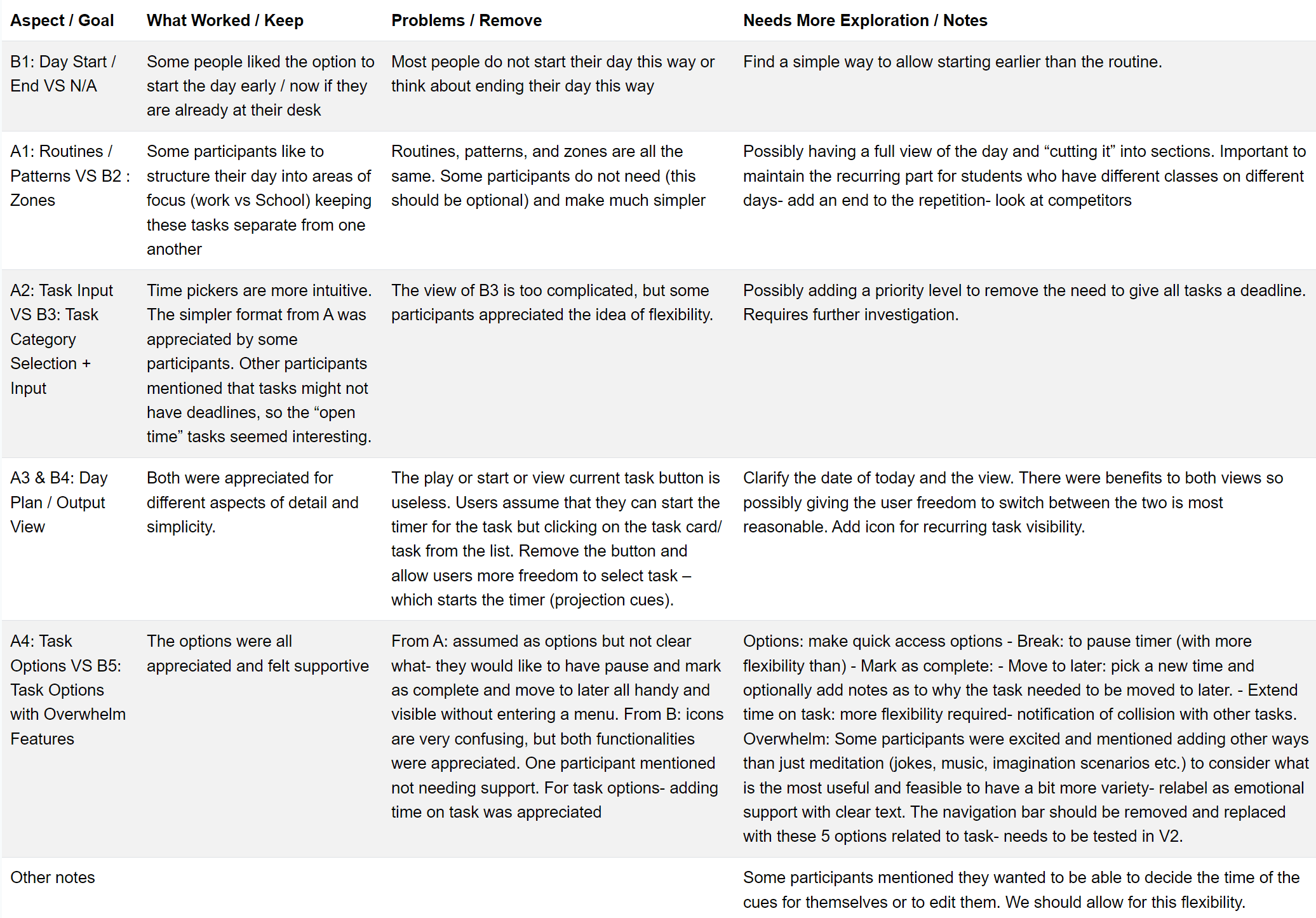
Summary of AB Comparison
Recap and Design Direction
Across these stages of exploration and testing, a clear set of principles began to emerge. What initially started as a broad investigation into task management tools gradually shifted toward a focus on how awareness could be embedded into everyday environments in a more subtle and supportive way.
From the focus group, the leaf and branch metaphor consistently stood out as the strongest direction. Participants interpreted it as calm, intuitive, and easy to understand without explanation. Unlike more abstract or literal representations of time, it felt natural and emotionally neutral. This made it not just a visual preference, but a meaningful foundation for how time and task progression could be communicated in a non-intrusive way.
The ambient prototype testing further reinforced a key insight: people do notice their environment, and they are receptive to subtle projected cues when they are working. The wall space behind the desk, often overlooked, became a viable channel for communication. Participants did not describe these cues as interruptions, but as something present in the background that helped them stay oriented. In many cases, they expressed that the projection added a sense of calm support, especially during longer or more demanding tasks.
At the same time, the paper prototype testing made an equally important constraint clear. While users appreciated flexibility and support features, the interface itself needed to be much more simple. As soon as too many concepts were introduced at once, such as zones, layered task types, or overlapping structures, users began to lose clarity. They could not easily build a mental model of how the system worked, even when individual features were useful.
This created a defining balance for the next stage of the project. The system must remain simple enough to program tasks quickly and without friction, while the complexity of guidance and awareness can be carried by the ambient layer rather than the interface itself.
Together, these findings established a clear direction moving forward. The leaf and branch metaphor will be carried forward as the core visual language. The environment will continue to play an active role in supporting awareness through subtle projection-based cues. And the interface will be deliberately simplified to focus on only what is necessary to set up, adjust, and maintain tasks.
The goal is not to build a complex productivity system, but to refine a calm and responsive one, where clarity lives in the app, and awareness lives in the environment.
03
Computer Prototype Evaluation
Prototype & Test Creation
Making the Prototype Testable
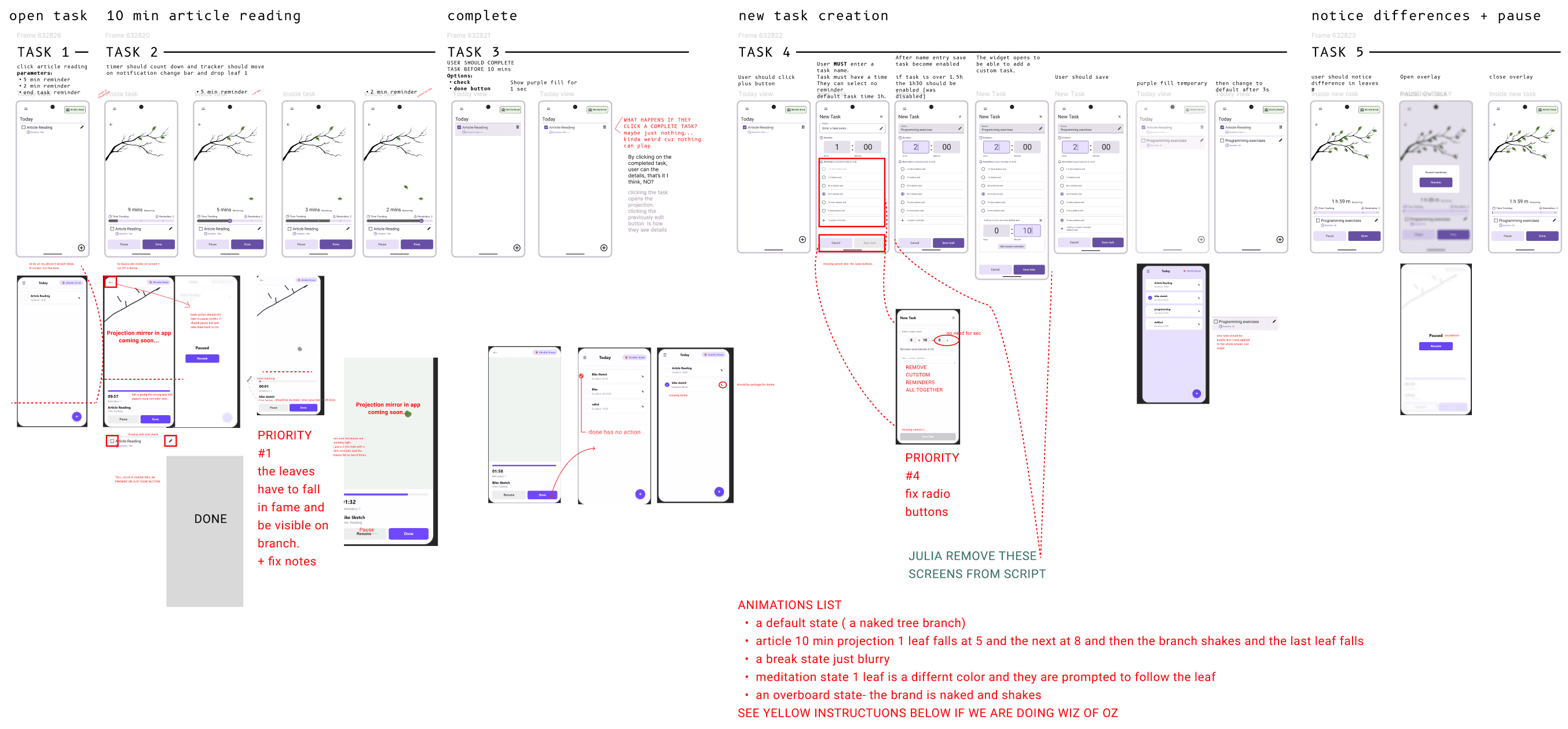
At this stage, the project shifted from concept validation to functional testing. The goal was no longer to explore ideas, but to ensure the system could be reliably tested by an external team without guidance or bias.
The prototype combined a working app interface with a simulated ambient projection layer. While the projection was still controlled using a Wizard-of-Oz setup, the app itself needed to function consistently across all interactions. This required close collaboration with an engineer to translate the design into a stable, testable system.
Some screens from V1 figma prototype
Collaboration & QA with Engineering
To prepare for external testing, we worked closely with our engineering teammate to ensure that all interactions behaved as intended. Communication primarily took place in Figma, where we documented bugs, edge cases, and mismatches between the app and projection behavior.
Rather than focusing on visual polish, this phase emphasized interaction accuracy. Each issue identified was tied to how it would impact a real user during testing. For example, inconsistencies in task states or unclear transitions between actions (such as pause or completion) risked breaking the perceived connection between the app and the ambient system.
This iterative QA process ensured that the prototype was not only functional, but coherent across both layers of the experience.
Example of communications and compromises with engineer during development

Proto of projections for testing

Proto of projections for overdue state
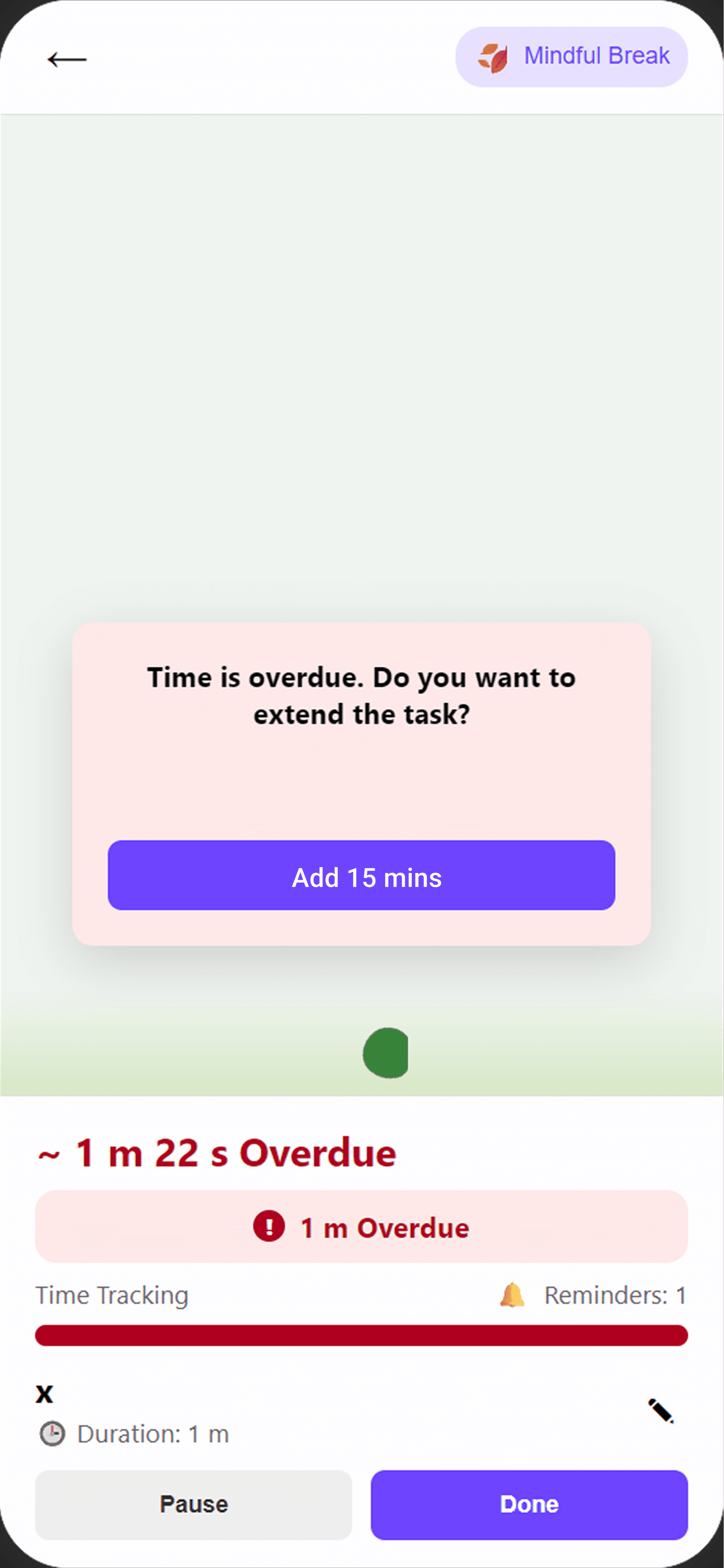
App screen for overdue state
Example Task:Overdue State & Recovery
One of the most complex scenarios tested how users respond when they run out of time on a task.
Participants were asked to complete a deliberately constrained activity (a 1-minute drawing task) designed to trigger an overdue state.
This task evaluated:
whether users noticed the transition into an overdue state
how they interpreted the change in ambient cues
what actions they expected to take next (extend, pause, or adjust the task)
On the system side:
the app updated the task status and presented recovery options
the projection shifted to a more urgent visual state
This scenario revealed whether the system could support users not just during smooth workflows, but during moments of pressure and interruption.
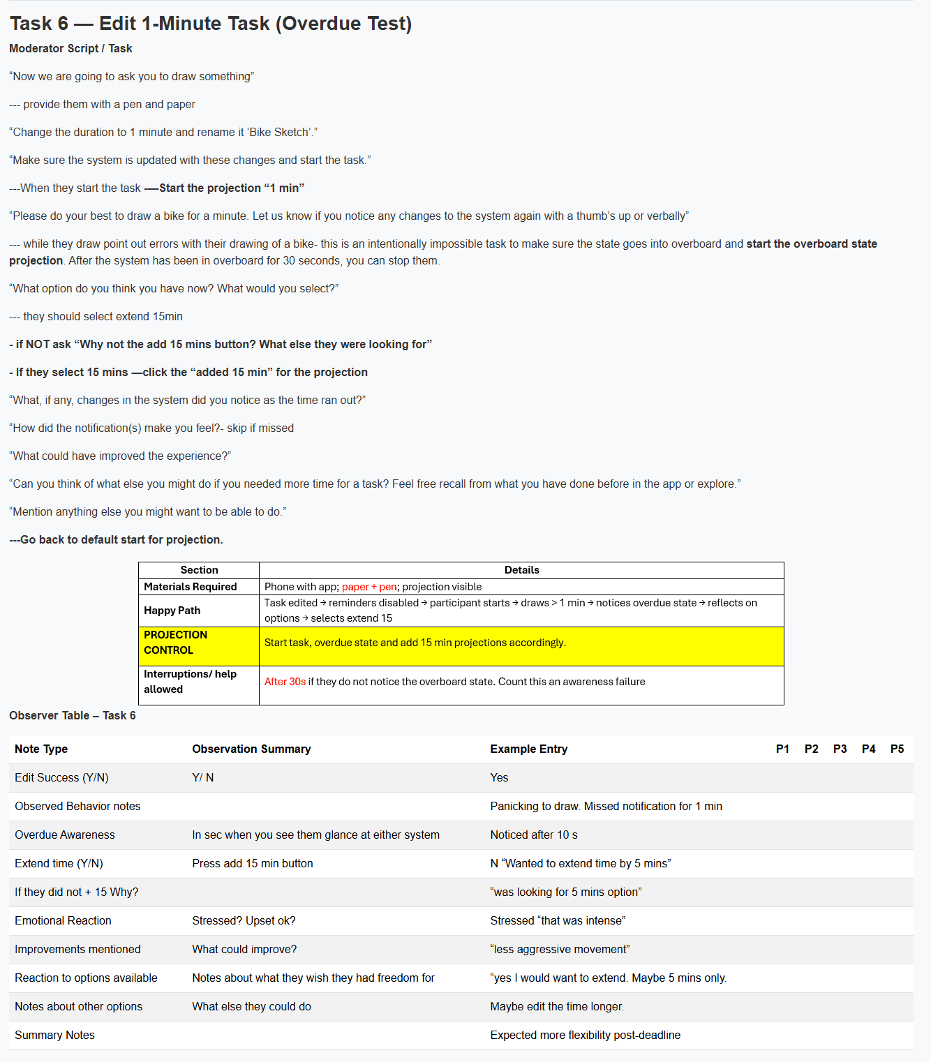
Example Scrip, scenario and Table for testing
Testing Results
Transition to Evaluation
By stabilizing the prototype and standardizing the testing process, this phase ensured that the results of external testing would reflect the system itself, not inconsistencies in execution. The following findings show how the system performed in use and how they informed the final design direction.
External usability testing and heuristic evaluation confirmed that the system is intuitive, calming, and learnable, with participants quickly understanding task flows and responding positively to the ambient experience. The leaf metaphor was consistently interpreted correctly, and core interactions like task completion, pause/resume, and mindful breaks felt smooth and engaging.
At the same time, testing revealed an important tension. While the system was designed to be subtle, some cues were too subtle. Participants occasionally missed or questioned the timing of leaf movements, especially when positioned outside their immediate focus. This highlighted the need to balance ambient awareness with perceptibility.
The most critical issue emerged in overdue task handling. Although users recognized that something had changed, they were often unsure how to respond. This pointed to a gap in clear feedback and recovery options, making it a high-priority area for improvement.
Task creation and control were generally successful, but users sought greater efficiency and flexibility, particularly through preset durations and more granular time extensions. Minor confusion around actions like task completion also indicated a need for clearer, more immediate affordances.
What We Took Forward
These findings directly shaped the next iteration:
Improved cue clarity without breaking calmness
Subtle enhancements to motion and positioning to ensure cues are noticeable but not disruptive.Redesigned overdue states
Clear, actionable options (extend, snooze, adjust) to support recovery in moments of stress.Streamlined task creation
Added preset durations and reduced setup friction.Simplified key interactions
Made actions like pause and completion more visible and immediate.Introduced lightweight onboarding
Optional guidance to help users quickly understand cue behavior.Maintained minimalism while allowing personalization
Expanded features like mindful breaks carefully, without adding complexity.
Key Insight
The system works best when it stays in the background—but not invisible.
Designing for calm technology means ensuring that the right signals surface at the right moment, without ever demanding attention.
04
Iterative Design
From Prototype to Calm, Usable System
Early iterations of the Ambient Task Reminder relied on a simulated setup, where projection states were manually triggered during testing. While this allowed us to explore the concept, it limited realism and consistency in user interactions. In the final system, we transitioned to a fully automated experience where actions in the app directly control the projection in real time. This shift transformed the prototype into an independent, responsive system, allowing users to experience the intended interaction without external intervention.
At its core, the system reimagines how we engage with time. Instead of relying on timers and notifications that interrupt focus, it introduces an ambient approach—one that communicates time through subtle, visual changes in the environment.
Testing revealed a key tension: while the concept felt calming and novel, users struggled with cue clarity, system feedback, and interaction control. The final design focuses on resolving these gaps by improving visual communication, interaction simplicity, and system responsiveness, while preserving the ambient, non-intrusive experience.
Strengthening the Visual Language of Time
Issue: Users didn’t always understand the meaning of the leaf animations, and some cues were too subtle to interpret reliably.
Solution: We redesigned all projection states using motion design, creating clearer, more expressive animations that better communicate time and task progression. I led the creation of these animated states using Figma (motion plugin), producing exportable assets for the developer to integrate.
How it works now
Each state (active, reminder, overdue, mindful break, and pause) is visually distinct through motion, pacing, and form. The system communicates time progression more clearly without adding intrusive elements.
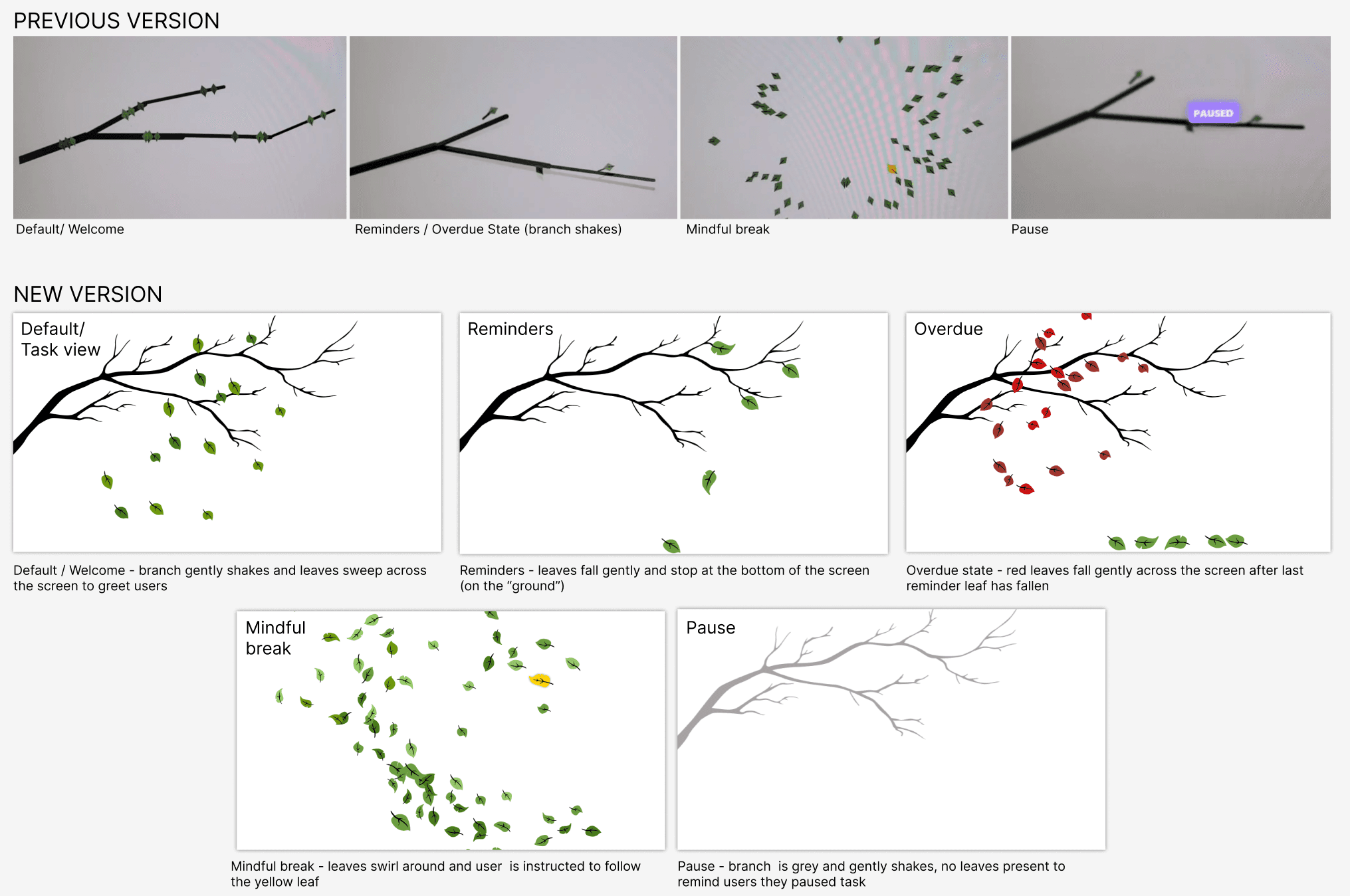
Old vs new stills of projections
Bringing the system to life
Issue: The app interface needed to trigger the projections
.Solution: Implementation the system states and interactions were programmed to match the user selections in the web app. ensuring consistency between what users do and what they see projected.
How it works now
Actions in the app (start, pause, mindful break, overdue) are clearly mirrored in the projection, creating a cohesive experience.

Making the Metaphor Immediately Understandable
Issue: First-time users didn’t immediately grasp what the leaf cues represented.
.Solution: We introduced a short onboarding flow explaining the system’s core interactions and visual language.
How it works now
Users are guided through key concepts (tasks, cues, mindful break) before first use, reducing confusion without disrupting the minimalist design.
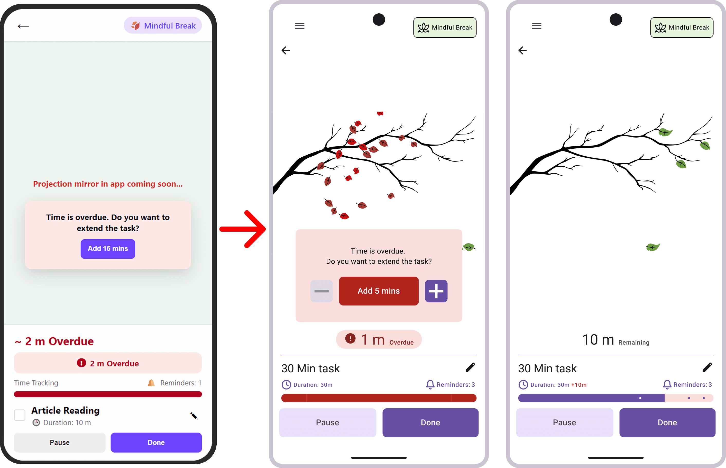
Improving Overdue Flexibility (Granular Time Control)
Issue: A fixed “+15 minutes” extension lacked flexibility and did not match how users naturally adjust their time.
Solution: We replaced the fixed extension with +/- controls, allowing users to adjust time in 5-minute increments.
How it works now
Users can quickly extend or reduce time based on their needs, creating a more responsive and forgiving experience during moments of pressure.
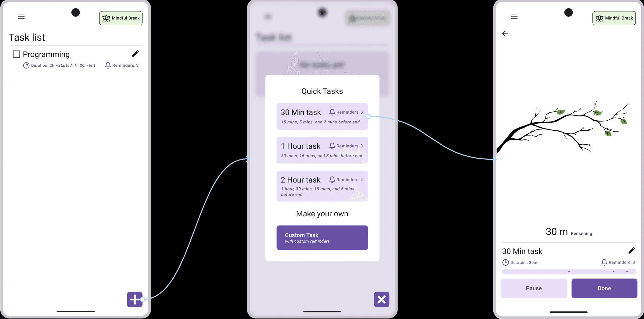
Enabling Instant Focus (Quick Task Shortcuts)
Issue: Starting a task required multiple steps, slowing users down when they were ready to begin working immediately.
.Solution: We introduced Quick Task options with preset durations (30 min, 1h, 2h) to support immediate task initiation.
How it works now
Users can launch a structured focus session instantly without entering task details, reducing friction while still benefiting from ambient reminders and time awareness.
Making the System Feel Alive (Continuous Ambient Feedback)
Issue: Static visuals made the system feel inactive, reducing awareness and reassurance.
Solution: We introduced subtle, continuous motion (gentle swaying) to maintain ambient presence.
How it works now
A soft, continuous animation signals that time is passing, reducing the need for users to check timers while maintaining a calm atmosphere.

05
Final Design
A Calm System That Works in the Background
After iterative testing and refinement, the final system brings together all improvements into a cohesive, responsive experience. The prototype evolved from a partially simulated concept into a fully functioning system where the app and ambient projection work seamlessly together.
Rather than adding more features, the final design focuses on clarity, responsiveness, and emotional support, ensuring that every interaction reinforces calm awareness instead of urgency.
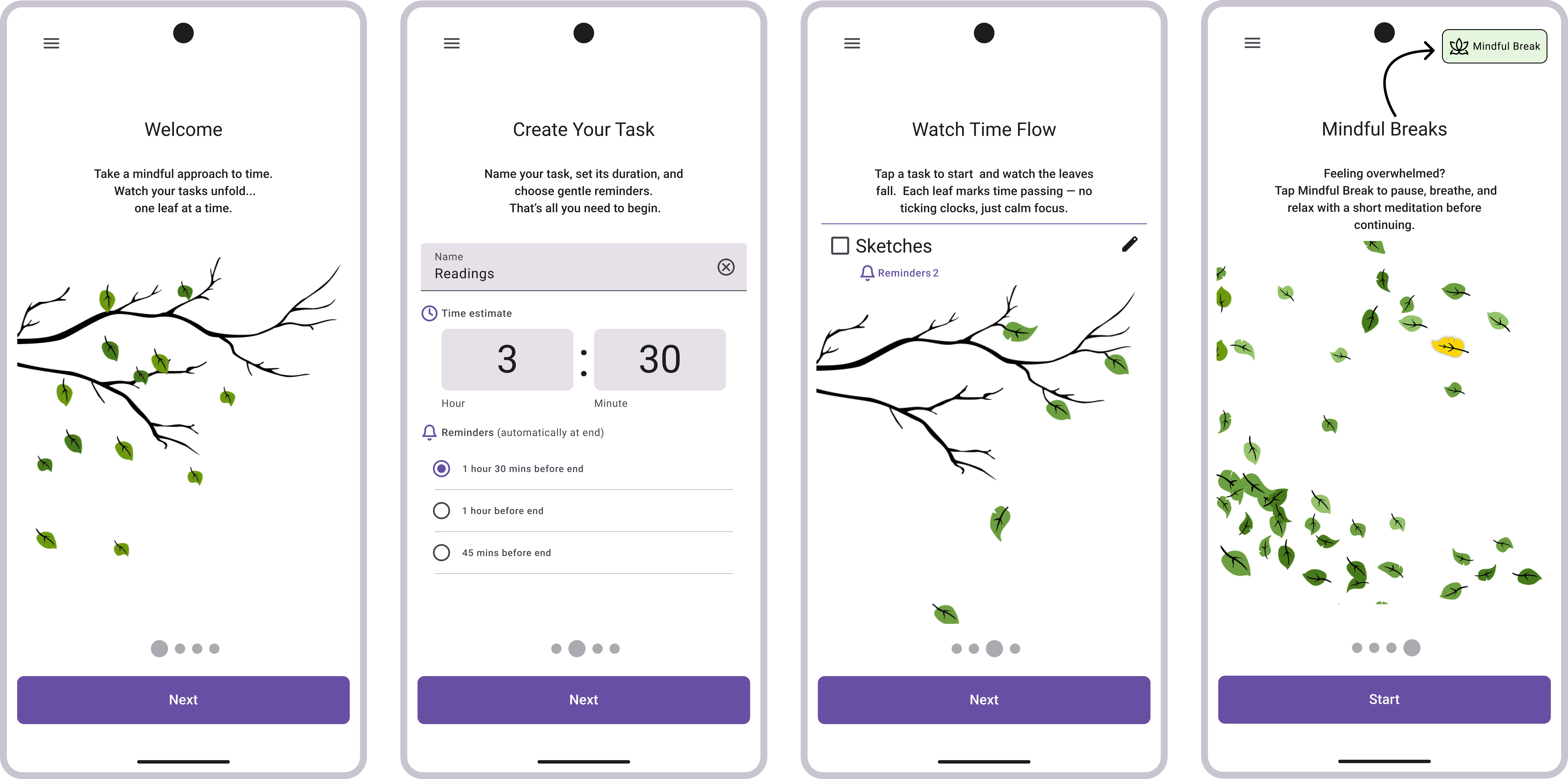
Final Prototype Walkthrough
This walkthrough presents the complete system in action. All interactions were refined following usability testing and peer feedback, resulting in a smoother and more intuitive experience.
End-to-end experience: onboarding, task flow, ambient cues, and system states
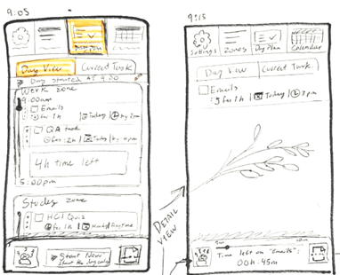
How the System Works
The system replaces traditional timers with ambient feedback that exists in the background of the user’s environment.
Users begin by selecting a quick task or creating a custom one with reminders. Instead of tracking time through numbers, they experience it through subtle visual changes.
A yellow leaf becomes the point of focus. As time passes, leaves fall at moments defined by the user’s reminders. This creates a rhythm that signals progress without interrupting attention.
When users look away from their screens, the projection acts like a window. It supports natural visual breaks and provides a sense of distance, helping users reset without reaching for their phones or losing focus.
If a task is not completed on time, the system transitions into an overdue state. The visual tone shifts, and users are given simple options to extend their time in small increments. This allows them to recover without pressure.
At any point, users can pause or enter a mindful break. During this state, the system removes task pressure and guides the user through a short moment of calm before returning to work.
Throughout the experience, the system stays present but never demanding. It communicates just enough to keep users aware, without pulling them out of their flow.
Outcome
The final system creates a different relationship with time.
It removes the need to check timers
It reduces interruptions and cognitive load
It supports focus through subtle, continuous feedback
Rather than managing time, users experience it.
06
Reflection & Future Opportunities
Beyond a Single Metaphor
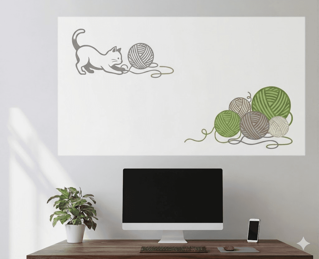
The leaf system worked well, but it is only one expression of a much larger idea.
Different users connected with different visuals. For some, the leaf felt grounding. For others, something more abstract or playful would feel more natural. This opens the door for a system that adapts to what each person finds calming.
Instead of a single metaphor, the experience could evolve into a set of ambient themes. Imagine replacing leaves with slow-moving clouds, drifting stars, water ripples, or even something more playful like a cat gently batting a ball of yarn.
The goal is not the leaf itself, but creating a visual language that feels personal and emotionally supportive.
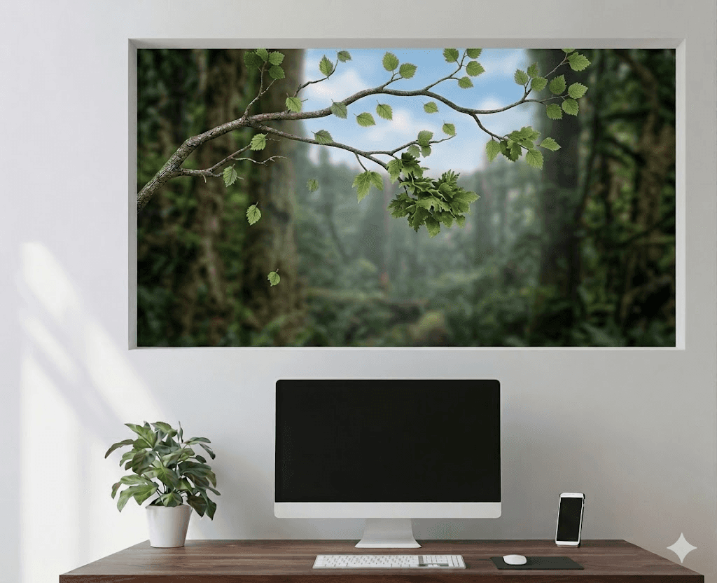
Designing for Psychological Comfort
One of the strongest insights from observation was simple: people naturally look away from their screens to reset.
The system builds on this by acting like a soft visual escape. It gives users something to look at that is not demanding, but still meaningful.
A future iteration could push this further by creating a stronger sense of depth. Instead of a flat projection, the system could simulate distance, like looking out a window at a far horizon.
This small shift could make the experience feel more immersive and restorative, supporting mental recovery during short breaks.
Balancing Calm with Structure
Early ideas explored integrating calendars, schedules, and full task planning systems.
While useful, these added too much structure and cognitive load for what this system is trying to achieve. The focus remained on calm awareness rather than optimization.
That said, there is still an opportunity here.
Some users, especially those with more fluid or creative workflows, need help understanding how long things actually take. A future version could gently support this by helping users reflect on time, without overwhelming them with planning tools.
The challenge is not adding more features, but finding ways to support structure while keeping the experience light.


Expanding the Sensory Experience
Right now, the system is entirely visual. But calm is not just something we see—it’s something we feel.
There is potential to expand the experience through other senses. Soft ambient sound, subtle breathing guidance, or even scent could deepen the feeling of calm and presence.
Some users imagined:
gentle nature sounds or music
nature smells as cue indicators
guided breathing rhythms
even small, unexpected moments like light humor or affirmations
The idea of following a single element, like the yellow leaf, comes from psychology. Focusing on one thing can help quiet the mind. Expanding this across senses could make the experience even more immersive.
From Individual Focus to Shared Spaces
While the system was designed for individual use, the idea naturally extends to shared environments.
In a meeting room, the projection could quietly signal how much time has passed, creating a shared awareness that helps everyone stay on track.
It could also support group focus sessions, where everyone works within the same ambient rhythm.
This shifts the system from a personal tool to a shared experience of time.
Final Reflection
This project started with a simple question: how can we stay aware of time without being interrupted by it?
The answer was not another tool, but a different way of interacting with time altogether.
By moving time into the environment, the system allows users to stay focused while remaining gently aware of its passage.
It shows that technology does not need to demand attention to be effective.
It can instead support users quietly, in the background, exactly when it is needed.
see also
Became: a visual walkthrough with live map highlighting, author credit, rating, and total time upfront.